THE SALES METRICS PLAYBOOK
Less Data, More Often
Too many businesses out there never get into an analytical rhythm. They never quite nail down how to measure whether they had a good week or a bad one. This is one of the first things we work on with new portfolio companies here at ParkerGale.
And it all starts with building the right weekly report.
Our approach isn’t complicated. We don’t force our companies to use AI or spend all their time pulling data. And to be honest, the stuff we measure is pretty basic.
Here’s the truth: Weekly reporting is more about building discipline than surfacing insights. It’s about creating a habit and, with it, a sense of fingertip‑feel for whether we’re winning or losing. It’s about constructing a system that helps you and your management team accumulate cycles: Reviewing the data, discussing it openly, taking stances about what they should do next, and taking action. Every week.
Now we’re sharing our approach for building a simple set of weekly sales metrics with you.
We call it Less Data, More Often.
We hope you like it.
What’s in the Sales Metrics Playbook?
HOW TO BUILD YOUR DATA DIET
Not all metrics are created equal. Our Less Data / More Often approach is built on the idea that picking a few metrics that answer the most important questions is where good reporting starts. We’ll show you how to cut through the noise and focus on the handful of questions that actually reveal what matters:
Are we creating enough new pipeline?
Are reps spending time in the right places?
Are we set up to hit the number?
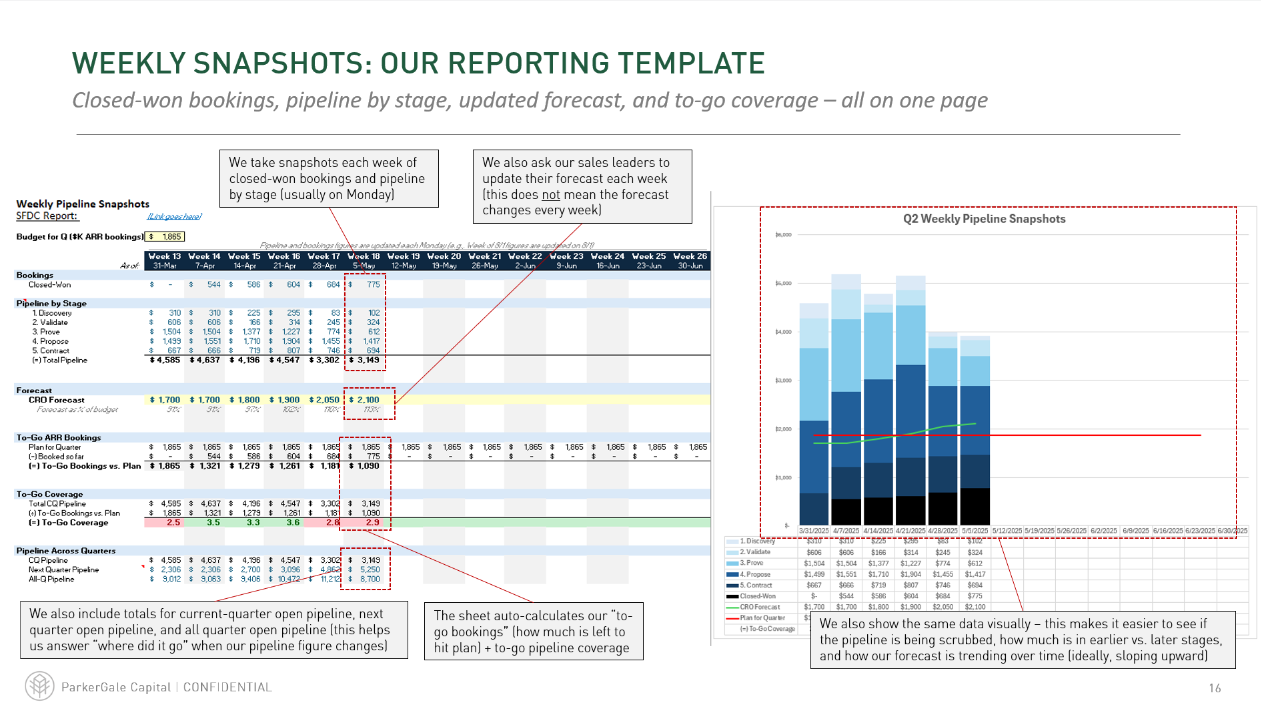
THE TEMPLATES WE USE WITH OUR PORTCOS
We’ve included the exact templates we use across our portfolio, fully editable and ready to go.
These aren’t just slides or high-level thoughts on metrics. We’re giving you a fully functional Excel reporting template, complete with a tab-by-tab plain-English explainer: what to track, how to use the templates with your team, and how to interpret what you’re seeing.
Whether you’re a first-time sales leader or just tired of blank stares in metric reviews, these templates are built to drive real conversations and better decisions. And we use them every week - so we know they work.
HOW TO BUILD A DATA-DRIVEN TEAM

Dashboards don’t drive change. People do.
This section is about building the operating rhythm that makes your data matter:
When and how to review your metrics
How to use them to run better pipeline and forecast meetings
How to create accountability without killing your team’s morale
If you want your team to stop reacting late and start adjusting early, this is where it starts.

GETTING REAL ABOUT VALUE CREATION
Reporting is just one of the ways we lend a hand inside our portfolio. In this special Youtube edition of the PE Funcast, Partners Jim and Paul walk through our POV on the typical PE value creation playbook, and lay out what we think matters most when it comes to being helpful to our companies.